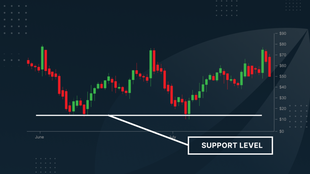
In the world of technical analysis, few concepts are as fundamental—and as powerful—as support levels. Whether you’re day trading stocks, navigating the crypto markets, or analysing long-term trends in commodities, understanding how to identify strong support can be the difference between a profitable trade and a missed opportunity. This guide explores the techniques, tools, and insights needed to find and interpret support levels on any price chart confidently.
Understanding Support Levels
At its core, a support level is a price point where demand historically exceeds supply. When a stock or asset declines to this level, buyers begin to outnumber sellers, creating upward pressure. This doesn’t always guarantee a bounce, but it increases the probability of price stabilisation or reversal.
Support levels are influenced by more than just price action—they’re also shaped by psychology. When a price repeatedly finds support at a certain level, market participants begin to anticipate this behaviour. As a result, more buyers step in, reinforcing the level and sometimes turning it into a self-fulfilling prophecy.
It’s also important to distinguish support from resistance. While support is a zone where price tends to stop falling, resistance is where price tends to stop rising. Understanding both concepts provides a fuller picture of price dynamics and trading ranges. For more information, view details here.
Characteristics of Strong Support Levels
Not all support levels are created equal. Some are fleeting and weak, while others persist over time, offering reliable cues to traders. One of the clearest signs of strong support is how often a price has tested the level and bounced. Repeated tests without a breakdown suggest that buyers consistently defend that price zone.
Volume plays a critical role as well. A strong support level is often accompanied by a spike in volume when the price reaches that point. This indicates increased buying interest, which reinforces the level’s reliability.
Durability is another key trait. The longer a support level holds over time, especially across different market conditions, the more meaningful it becomes. Support that’s visible on multiple timeframes—say, both the daily and weekly charts—is also more significant. These levels attract attention from both short-term and long-term market participants.
Tools and Indicators to Identify Support
The most straightforward technique is drawing horizontal lines at historical price lows. These lines often reveal clear areas where buying pressure emerged in the past. If the price bounced off a level multiple times, that horizontal support becomes a reference point for future moves.
Trendlines offer another approach. By connecting rising lows in an uptrend, traders can draw diagonal support lines. These trendlines act as dynamic levels that rise over time, providing insight into the trend’s strength and potential reversal points.
Lastly, pivot points—especially in shorter-term trading—can offer insight into where price may find intraday or weekly support. These are calculated using the previous period’s high, low, and close and often serve as key reference points for market participants.
Chart Patterns Signalling Strong Support
Certain price patterns naturally highlight areas of support. Double bottoms are a classic example. This pattern forms when price tests a low twice and fails to break below it, signalling strong buying interest.
Triple Bottom Line is a variation of the same idea, offering even more confirmation that buyers are defending a specific level. These patterns often precede bullish reversals and can be very reliable if confirmed with volume.
Rounding bottoms show a slow, steady shift in sentiment from bearish to bullish. The gradual curve at the bottom of the chart reflects a transition period where buyers begin to gain control.
Multi-Timeframe Analysis
One of the most effective ways to validate a support level is by checking it across multiple timeframes. A level that holds on the daily chart may not be as significant as one that also appears on the weekly or monthly chart. When different timeframes point to the same support level, it amplifies its credibility and relevance.
Multi-timeframe analysis also helps you filter out noise. While the 5-minute chart might suggest a break of support, the daily or weekly chart could show that the broader trend remains intact. This layered view helps traders avoid false signals and stay aligned with the market’s bigger picture.
Common Mistakes to Avoid
One of the biggest pitfalls traders face is mistaking a temporary price bounce for a reliable support level. Just because the price bounced once doesn’t mean the level will hold in the future. Confirmation is key—look for repeated reactions or confluence with other indicators.
Ignoring volume is another common mistake. A price level that holds without meaningful volume support may lack the conviction needed to sustain a reversal. Volume acts as a vote of confidence from market participants and should not be overlooked.
Lastly, support levels are not set in stone. Markets evolve, and so do support zones. It’s essential to adapt your analysis as new data emerges and not become anchored to outdated price levels.
Conclusion
Identifying strong support levels on a price chart is both an art and a science. It involves understanding price behaviour, market psychology, and the use of technical tools. When done correctly, it provides a reliable foundation for strategic trading decisions. The key is not just to spot support but to evaluate its strength through volume, pattern recognition, and confirmation across timeframes.


